The Baltimore Clippers
Ship Captain Inspired?

The Boston Braves
Straight Up Racial

The Buffalo Bison
Sell-Outs.

The Carolina Monarchs
What does Carolina have to do with Monarchs and what do Monarchs have to do with Lions? Good thing you trademarked it...I'm sure there's tons of people desperate to rip this one off.

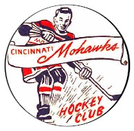
The Cincinnati Mohawks
Also racial, and strange feet, but a cool oldie-time look.
The Cincinnati Swords
The Swords? I've never heard of a team called "The Swords" before. Sean Connery.

Cleveland Barons
I'm not sure what this picture is supposed to be

The Cleveland Barons
In 2001 they changed their logo from something not entirely distinguishable to something just stupid. A shark in a top hat? What the?

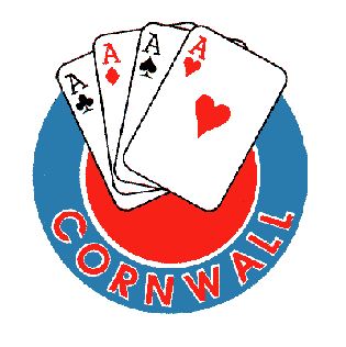
The Cornwall Aces
This one is sick!
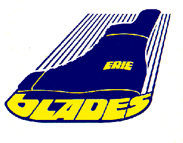
The Erie Blades
Sick name and logo
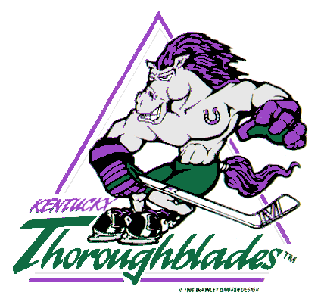
The Kentucky Thoroughblades
The Thoroughblades? Yes, we get it, you love horses in Kentucky, but really how horse-centric do you have to be? I guess they found the lone hipster in town to chose the colour scheme. But a horse with purple hair? Please. Oh man...there's just so much strangeness here.
The Nova Scotia Voyagers
Does this logo inspire confidence in your team? These guys look lost.

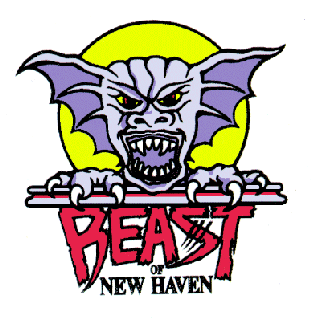
The Beast of New Haven
Horror themed hockey - previously the Carolina Monarchs
The St. Louis Flyers
Oldie Time!!!

The Syracuse Indians
Racial!

Yo Dayvid,
ReplyDeleteRemember the other day when I told you I had two pieces I was working on for the blog? One of them is about this exact same subject. Weird!
Does that mean ima get a shout out on your blog?
ReplyDeleteI think so.
ReplyDelete